Pages
- How I Learned to Start Worrying and Hate the F-Factor (Part 1) 7 views
- Daehlie vs. Smirnov 3 views
- North American WSC Assessment 3 views
- Most Unimproved Women: Distance 3 views
- Victims & Nemeses 2 views
- Head-to-Head 2 views
- Race Snapshot: IBU World Cup Sprint 2 views
- Career Retrospective: Simone Hauswald 2 views
- WJC/U23 Preview: USA and CAN 2 views
- Sprint Quarterfinal Choices 1 view
Tags
Age Analysis biathlon bump chart canada classic cycling Davos development devon kershaw Distance fis points freestyle giro d'italia kikkan randall kris freeman kuusamo liz stephen marit bjoergen mass start men most improved norway olympics pursuit race snapshot recap retirement retrospective season preview sochi Sprint stage race sweden tour de france tour de ski U23 USA usst wbc week in review WJC/U23 women World Cup WSC
Beitostoelen
More strong early season performances from some Americans in Norway this weekend. How strong? Let’s take a look.
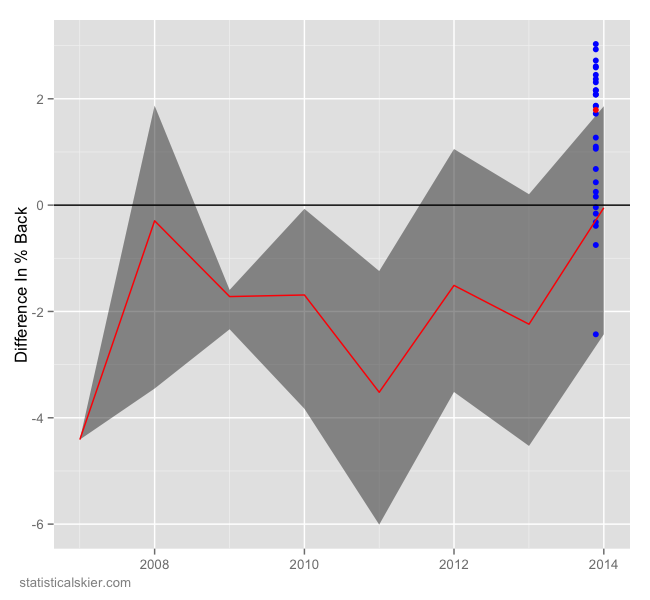
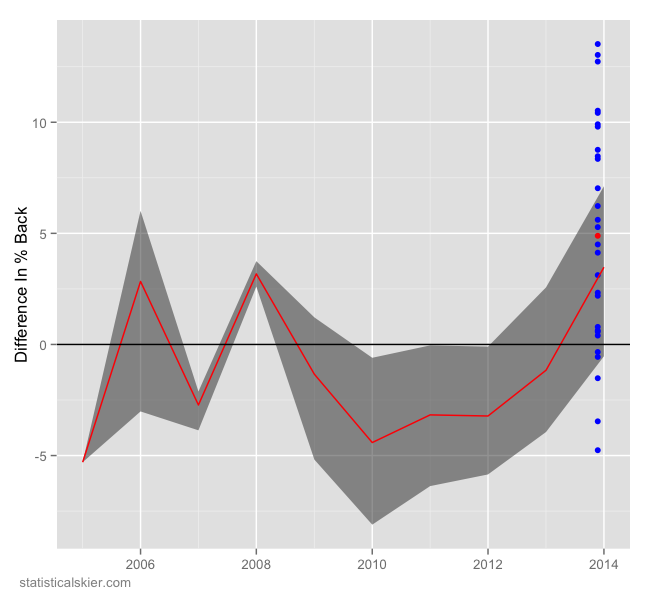
First up is Sadie Bjornsen who had a very strong 5th in the 10k classic.
Values above zero are good. The grey shaded region and red trend line represent how she has performed against these specific skiers in the past. She had already made a big jump last season, and this race was very strong even compared to that. Next up Noah Hoffman:
This is the better of his two races, the 15k freestyle. This result was considerably better than he normally does against this crowd compared to last season. His classic race (graph omitted) was somewhat worse that usual, but not dramatically so. Lastly, Liz Stephen had a strong result in the 10k freestyle:
She’s been on an upward trend for several seasons now, and this would suggest that might continue.
Tagged Analysis, beitostølen, fis, men, USA, womenMuonio: Petr Sedov
This first batch of races for 2013-2014 are in from Muonio, Finland. As always, it’s difficult to read much into a single race, particularly early season races like these. You never quite know who’s still in the midst of a big training block and how seriously people are approaching them.
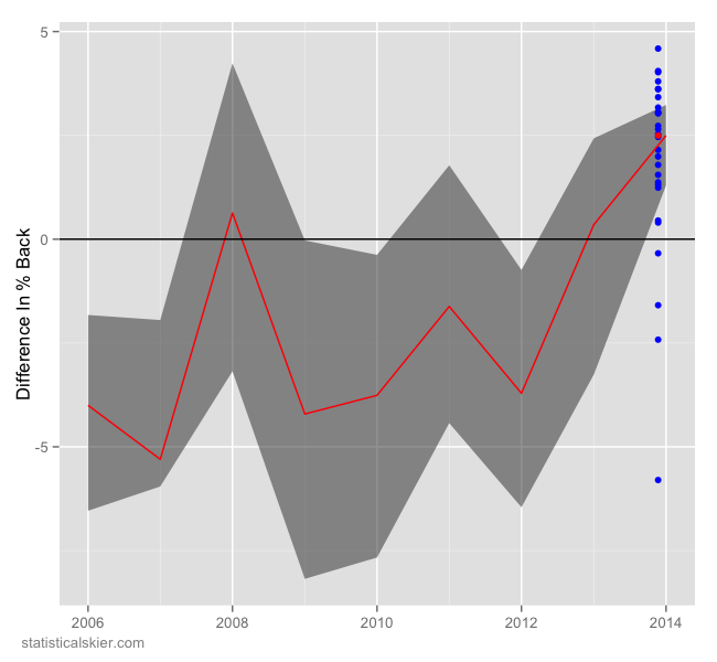
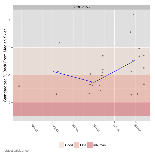
Still, I thought it was interesting that Russian Petr Sedov won the last race of the weekend, the 15km freestyle. He’s still fairly young, and after a promising introduction to the World Cup he kind of slipped back a little last year, I think:
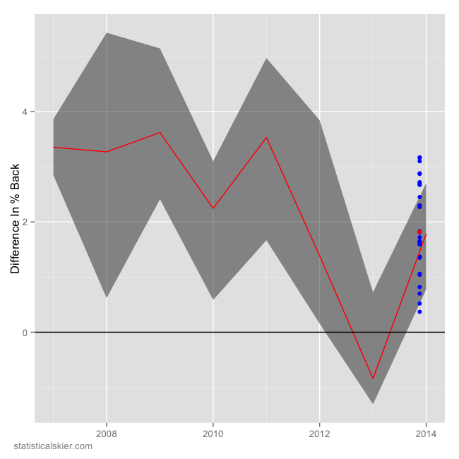
He had a handful of strong races last year, but was much less consistent in general. If we look at this Muonio 15km race in particular, we can get a better sense of the quality of his race by comparing how he did to each of the top 30 skiers at the Muonio race to how Sedov has fairly against those specific people in the past:
Values greater than zero are better for Sedov in this graph. The blue dots are the differences in percent back between Sedov and the other skiers at Muonio (he won, so they are all above zero). The shaded region with the red trend line summarizes how he’s fairly against this specific group of skiers in the past.
As you can see, he generally dominated them, and then last season struggled considerably, losing to this group almost as much as he beat them. If this is a sign of things to come, we could see more of the Petr Sedov from two years ago, or perhaps an improved version.
Tagged Analysis, muonio, petr sedovHistorical Points In North American vs Europe
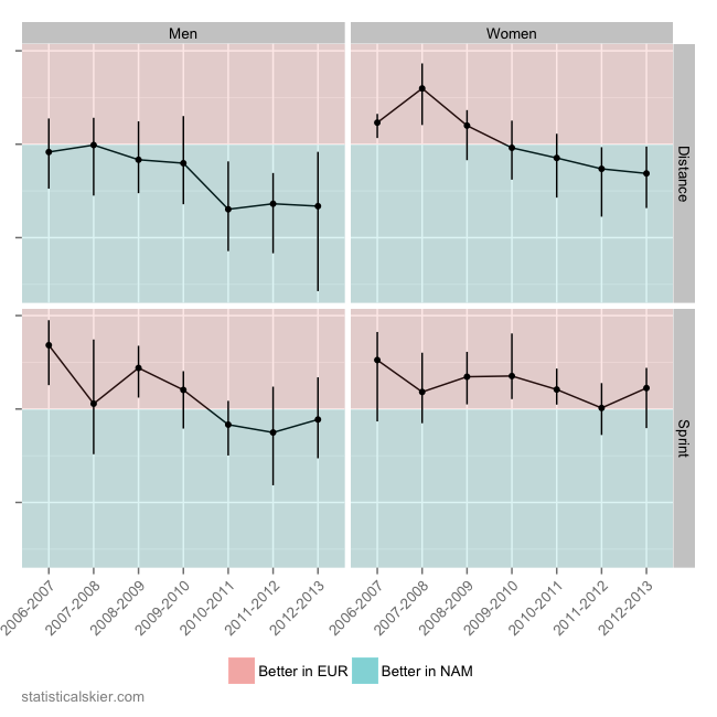
A little later than I’d intended, but here it is. Instead of just the previous season, this is a view of the difference in median FIS points in Europe versus in North American for all North American athletes, in all events. Since we’re looking at multiple years, the graph is a bit different. For each season, we have the center of the distribution of median differences (the median of the medians, if you will) and the bars represent the middle 50%.
This is interesting on a few levels. First, if you looked at just last season, and saw the the North American female sprinters were getting better points in Europe than in North America, there would be a temptation to attribute that to the increased success by folks like Kikkan, Jessie Diggins, Ida Sargeant, etc. But here we can see that the points for North American female sprinters have pretty much always been better in Europe!
The other three panels all to some degree show a shift away from good points in Europe towards better points in North American. It’s a weak trend for the male sprinters, but much stronger for both the male and female distance events. The other interesting difference is that there seemed to be a sharp jump for the men’s distance skiers in 2010-2011. Normally that would make me wonder about changes in the population (i.e. a sudden jump in the number of non-USST folks racing in Europe), but the fact that the other panels look so different makes me skeptical.
Tagged Analysis, canada, fis points, USA, usa canadaFIS Points – Europe vs NAM
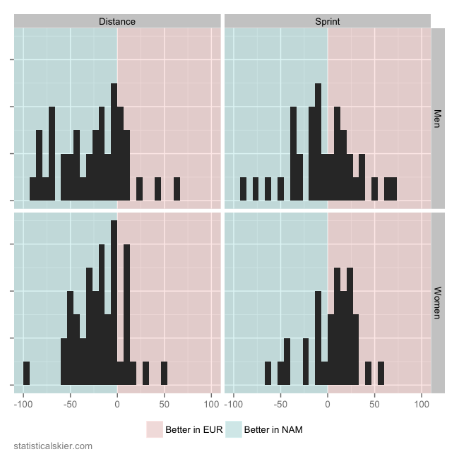
Last week I wrote about how US and Canadian skiers fared last season, in terms of FIS points, when racing in North America versus in Europe. That included a rather almost too perfect looking symmetric, normal distribution for the men’s sprinters. On it’s face this suggests that the difference in median points earned by North American sprinters in Europe versus at home, while possessing a fair bit of variation, is basically centered perfectly at “no difference”. A reader complained about this apparent statistical anomaly, so I offer the following:
This is the exact same plot, only instead of a density estimate I’ve used a simple histogram (yes, yes, I know, a histogram is a sort of density estimate). I suppose if you wanted to get all shamanic and read the tea leaves on this, you could argue that the four short bars on the extreme left of the men’s sprint panel argues for a less symmetric distribution than the density estimate showed. But I think we’re splitting hairs at that point.
The sample size here is what I’d call medium-ish, at around 75 individuals for the men’s sprint panel. I think the best argument against what I posted last week is not that the distribution appears remarkably symmetric, but that perhaps my choice of smoothing parameter for the density estimate (in truth, I simply used the defaults for my software) were perhaps a bit….aggressive for 76 data points.
Later in the week I’ll update this with a look at how these values have changed from season to season.
Tagged Analysis, canada, fis points, US