When most people say that World Cup skiers are animals, they probably mean they are fierce, strong competitors. Â I got my PhD in statistics in a department that found itself working quite often with very strong wildlife biology and ecology departments, so for me that reference leads me to think, “Well, what if they really were animals? Â What sorts of statistics might I end up doing on these data?”
A common statistical analysis when your subjects actually are wild animals is called survival analysis. Â Very generally, the aim is to determine what factors influence the survival of, say, bears[1. Usually, the organism isn’t nearly this exciting. Â Typically I’d see data on something like the western spotted shrew, or the golden mantled ground squirrel. Â One of those animals I made up, the other I did not.]. Â The poor biologist would spend countless hours over multiple summers capturing, tagging and then tracking and recapturing the shrews or slugs or whatever[2. Stats grad students would frequently talk about how grateful we were that we didn’t have to do field work.].
The end result would be a bunch of lifetime data (along with other variables) on individual organisms. Â Then the question is, which variables seem to influence survival rates? Â There are all sorts of technical details with this kind of data (censoring, mainly) on how to model it that I’m not going to get into here. Â If some nerdy biologist is reading this and wants more details, let me know, and I’ll put them in the comments.
For everyone else, the basic concept you need to wrap your head around is what a survival curve is. Â A survival curve tells us what what proportion of animals are alive at each given point in time.
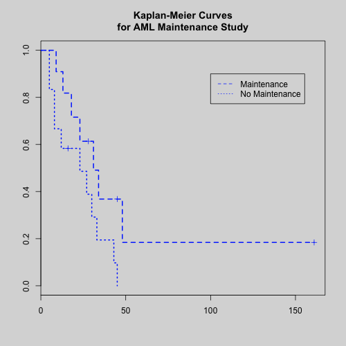
Here’s a quick example that I pulled from the help files of the stats software I use:
This graph comes from medical research data on humans, and compares two survival curves based on a treatment variable. Â The “Maintenance” treatment for the study saw better survival rates. Â The x-axis here is in days, I believe, so each spot on these curves tells us the proportion of subjects still alive after that many days.
Now, how is this relevant to skiing? Â Consider a skiing career on the World Cup circuit as a “lifespan”. Â You’re born (first WC start), you ski for a while, and then you “die” (stop racing, at least in WCs). Â Since I’m keeping this analysis as simple as possible, I chose only the following variables to include in the model:
- Gender
- Nation (Grouped into Tier 1, Tier 2 and Tier 3[3. Tier 1 = NOR, SWE, FIN, GER, ITA, RUS, Tier 2 = FRA, SUI, AUT, KAZ, EST, CZE and a few others, Tier 3 is everyone else.] nations. Â USA and CAN get their own category; so this variable has five possible values.)
- Number of WC starts by age 24
- Average FIS points of first ten distance results
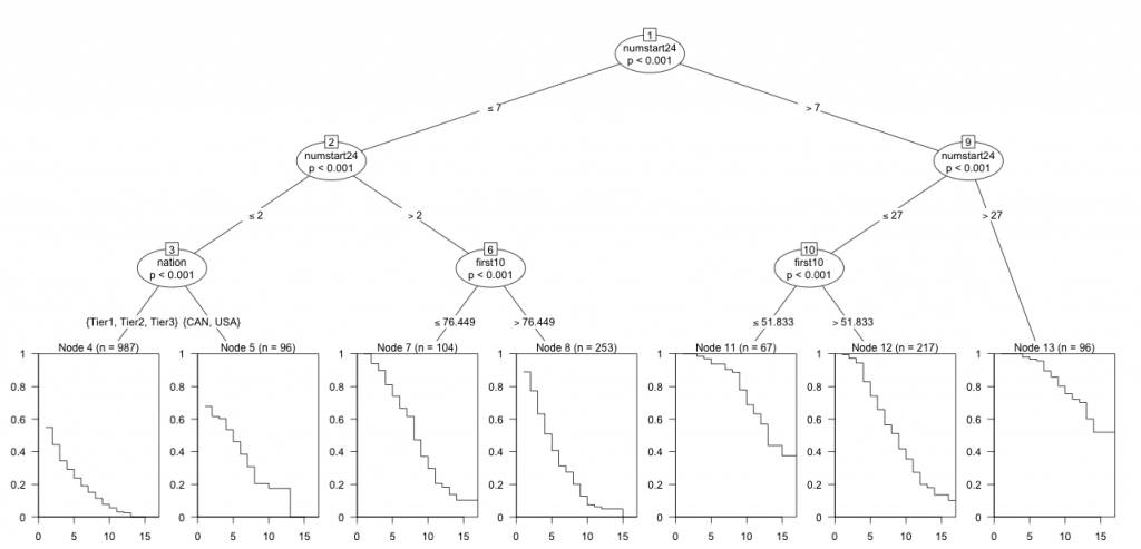
As you might have guessed, I’m only considering distance results at the moment. Â My model sifts through the data (lots of stuff being glossed over here) and shows me how survival rates differ with respect to these variables. Â Here’s the key graph:
It’s a big one, so you’ll have to click on it for a larger, readable version.
What we have here is a big tree diagram[4. Again, biologists may be wondering what the hell is going on. Â Tree based models were sort of my bread and butter in grad school, so I’m using a kind of fancy recursive partitioning based survival analysis model. Â Basically, it’s like a regression tree, but with a survival curve estimated in each terminal node.]. Â The model has partitioned our data based on the greatest differences it found in survival curves. Â Reading from the top to the bottom, each oval tells us how the model decided to split things up. Â (Ignore the p-values.) Â At the top, we start with all the data, which is then split into two groups: more than 7 starts by age 24 and less than or equal to 7 starts by age 24.
If we follow the branch to the right, we get another split into skiers who’ve had more than 27 starts by age 24 and those who’ve haven’t (i.e. between 7 and 27). Â Continuing to the right, we come to Node 13, which contains 96 values from our original data set. Â The survival curve for this subgroup suggests that even after 15 years, we’ve seen only 50% “mortality”. Â The nodes labelled ‘first10’ refer to splitting on the average of your first ten races. Â The node labelled ‘nation’ way over on the left looks like something really important is happening there. Â I’ll come back to that in a moment.
I must emphasize that this model, based on observational data, does not, in any way shape or form, tell us what will happen to a skier if they have a certain number of start by age 24, along with other conditions. Â It only tells us what has happened to skiers like that. Â The usefulness of a model like this comes from visualizing features of the data, not making predictions. Â Neither I, nor the model, is saying that if you take a skier, regardless of quality, and simply give them more starts at a young age, that they will survive longer on the WC.
Ok.  The big picture here is that the model has divided our data up primarily based upon the number of starts you’ve seen by age 24.  I apologize for the strange numbering of the nodes (ovals) but we’ve got Node 6 (≤ 2 starts by age 24), Node 4 (between 2 and 7 starts), Node 10 (between 7 and 27) and Node 13 (>27 starts).  According to the model, that’s the biggest factor accounting for differences in survival rates among our skiers.
Node 13, the group with a ton of starts isn’t split anymore and they have the highest survival rates. Â The middle two groups, Nodes 6 and 10, are split based upon the quality of their first ten starts. Â Finally, the group with almost no starts by age 24 is split on the ‘nation’ variable. Â In general, the survival curves get worse as we move from right to left along the bottom.
That’s what we have. Â What does it mean? Â Let’s start at the right and move leftwards. Â The skiers with >27 starts by age 24 are the people who’ve been identified as great talents early on. Â Most likely they’ve actually had stellar WC results very early on. Â There is a reason, after all, that they’ve gotten so many starts at a young age. Â They’re fast. Â So it makes sense that they will last a long time on the WC. Â They aren’t lasting longer because they get more starts, they’re lasting longer because they’re fast. Â They get more starts because they’re fast.
As we move into groups of skiers with fewer starts, we begin to see a dependency on the quality of their initial results. Â For example, skiers with a medium number of start (7-27) by age 24 will tend to last longer on the WC if their first ten results average below ~52 FIS points. Â (Node 11 has a better survival curve, at least in the long term, than Node 12.) Â A similar thing happens for skiers with 2-7 starts, but the threshold is somewhat higher: ~76 FIS points. Â Also, the difference between the survival curves here (Node 7 vs. Node 8) is a bit smaller.
Finally we have the &le 2 starts group. Â For North American skiing fans, alarm bells are probably going off right about now, but take a deep breath and chill out. Â This isn’t as big a deal as it looks. Â Recall that I classified the ‘nation’ variable into several categories roughly based on the quality of ski programs in that nations (Tier 1, 2 and 3) and then CAN and USA are there own categories.
Technically, what this last part of the model is saying is that among skiers with at most 2 WC starts by age 24, those from USA/CAN tend to survive longer than those from pretty much anywhere else. Â (Keep in mind that USA/CAN are being compared not to individual nations, but sort of the aggregate of groups of nations.) Â If this seems counterintuitive, let me attempt to square this circle:
If you’re a skier from, say, Norway and you’ve done ≤ 2 starts by age 24, things are looking pretty bad.  Norwegian skiing is super competitive.  There’s little chance of you continuing to get WC starts at this rate.  At the other end of the spectrum, the Tier 3 nations are made of up countries like Algeria, Israel and the like, countries with almost no ski program at all.  These nations tend to send 1-2 skiers to World Championships or the Olympics for national prestige reasons, but aren’t going to spend money on a serious ski program.  So athletes from these countries get a handful of starts at big events like these and then disappear because there’s no support in their country for skiing.
The fact that the USA and CAN are singled out here is simply highlighting the fact that we don’t have a very deep pool of racers (compared to NOR, SWE, etc.), but compared to some other countries (Algeria, Israel, etc.) we actually have some money for a ski program. Â Enough to commit to a continual presence on the WC, at any rate. Â So we are relatively more willing to commit resources to skiers who “start later” than other countries.
You may recall that gender was a variable I originally included in the model. Â Well, it turns out that the model didn’t find much difference between men and women, at least in terms of survival rates.
Obviously, this is a very simplistic survival model, but it did identify some interesting features of the data, I think. Â But I must warn you again that this model is not useful for making decisions about how to produce skiers that will “survive” longer (supposing that were our goal, which it might not). Â This is intended for exploratory purposes only.
[ad#AdSenseBanner]


{ 3 } Comments