[Note: This article first appeared here.]
Chris Grover recently mentioned a graph,
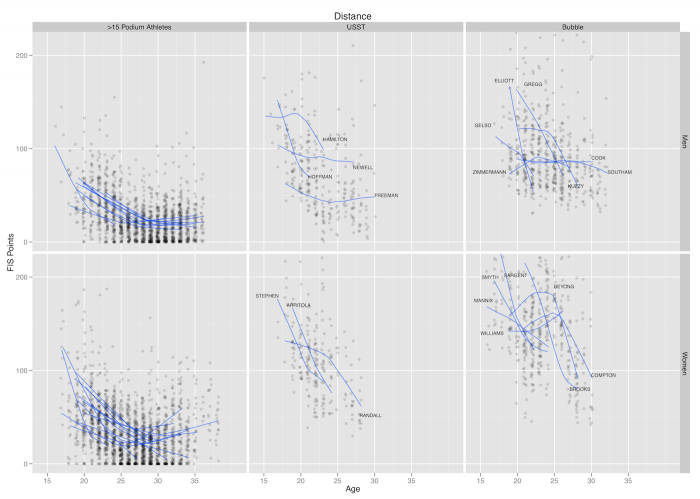
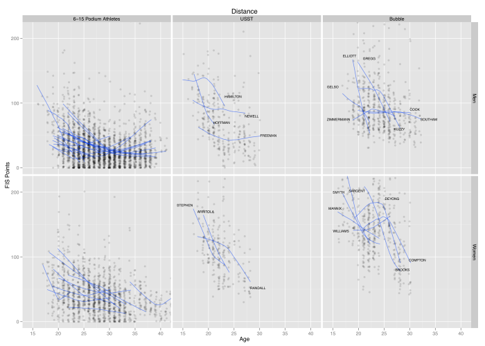
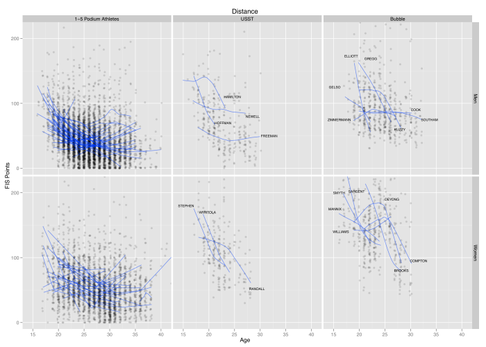
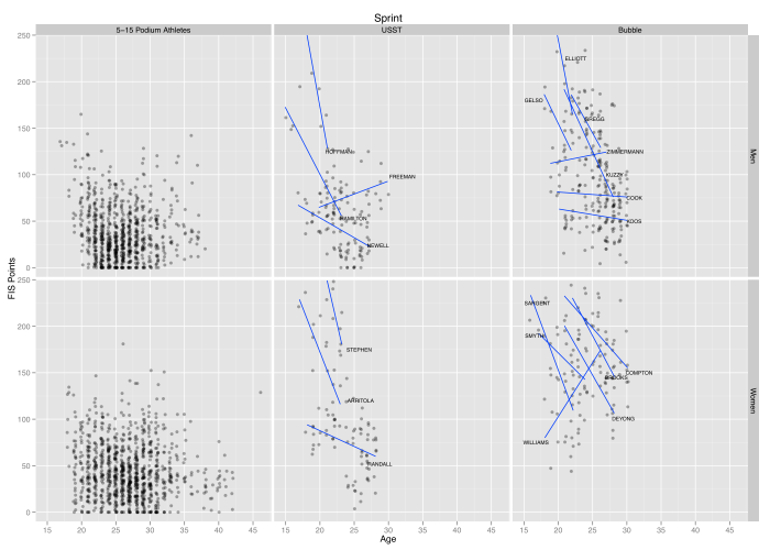
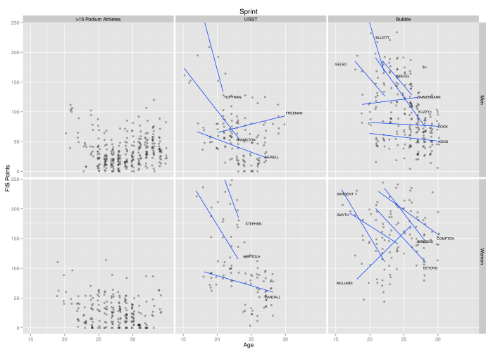
“Every athlete who is being nominated to the U.S. Ski Team this year has something in common. Â They are on the path to winning a medal. This medal could from the World Cup, World Championship or Olympic Winter Games, but they are on this path. Â If we graph these athletes’ ages versus their FIS points and plot those graphs against the progress of the best cross country skiers in the world, we can see that they are on the path.”
Being a statistics and data junkie, I excitedly scrolled up and down the article looking for this graph. Â Alas, it was nowhere to be found! Â But it sure sounded like a cool idea, so I thought I’d give it a try myself. Â I can’t read Chris Grover’s mind and know precisely what he meant, so what follows is simply my interpretation of what I think he might have meant, with some of my own twists added in.
This is what I did:
– Only results since 2001-2002 are used. Â All FIS scored events that I have are used, not just WC, WSC and OWG races. Â Personally, I wouldn’t consider mixing races like this advisable, but it’s what the national ranking bodies do for FIS point lists, and I’m just trying to approximate what Grover seemed to be talking about.
– I cannot guarantee that I have every FIS scored race for every athlete. Â For instance, I don’t believe that I have each and every American collegiate race that’s been FIS scored. Â I have some but not all.
– FIS points are used for both distance and sprint events. Â Again, this isn’t my ideal way to measure athletes in all cases, but it’s what FIS, USSA, the USST etc. use and it’s what Grover referenced in his article.
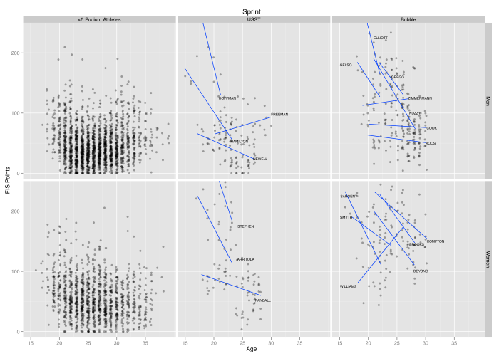
– For both distance and sprint races I created three categories of racers: Podium athletes, USST athletes and “bubble” athletes. Â Bubble athletes are Cook, Elliott, Gelso, Kuzzy, Southam, Zimmerman, Sargent, Deyong, Mannix, Williams, Brooks, Smyth and Compton for distance and the same for sprint (minus Mannix). Â I got some advice from people more familiar with the domestic racing scene than myself on who to include; I apologize if I omitted your favorite racer! Â I didn’t have room for everyone.
– Podium athletes are further broken down into three categories: less than 5, 5-15 and more than 15 podiums over their career.
– I plotted FIS points versus age for each group with trend lines for each athlete, where possible. Â Dots represent a single result by an athlete, blue lines represent trends for a particular athlete. Â Large outlying FIS points results may not appear in the graph because I zoomed in to show the important stuff more clearly.
– The USST and Bubble panels are the same within each Distance and Sprint graph. (Eagle eyed viewers might note that this isn’t exactly true; I jittered the ages very slightly to avoid technical issues in fitting trend lines. Â Specifically, I needed to avoid singular design matrices.)
– The Podium Athlete panel changes each time based on the <5, 5-15 or >15 category.
– I omitted the Podium Athlete trend lines in the Sprint graphs because, unlike in the distance case, they were just a tangled mass of spaghetti. Â This could be due to the newness of sprinting; we might see more definite athlete development patterns emerging after the discipline has been around for some time.
– Distance event trend lines are obtained using a smooth, but robust method, to limit the impact of small numbers of unusually large or small FIS point values. Â Due to a general reduction in data size, I was forced to go with simple linear trends in the sprint graphs.
– I attempted to annotate each trend line for the USST and Bubble panels with the athlete’s name. Â I apologize if it’s a little hard to read, I did the best I could in a short time frame.
Finally, a general disclaimer: my purpose in creating this graph was simply that Grover’s comment seemed like a fantastically interesting thing to look at, and I was a bit miffed that it hadn’t occurred to me before.
Enjoy!
Post a Comment