It’s not skiing, I know, but I do like to entertain myself by making pretty graphs. So like last summer I’ll be doing some graphical displays for some big stage races. I won’t provide any discussion or analysis, just the graphs for you to enjoy, pass along or share as you please.
I do try to take requests, though, so if there’s a particular graph or analysis you’d like to see, let me know in the comments and I’ll do my best to oblige. Keep in mind, though, that I don’t have access to anything beyond the simple results from each stage.
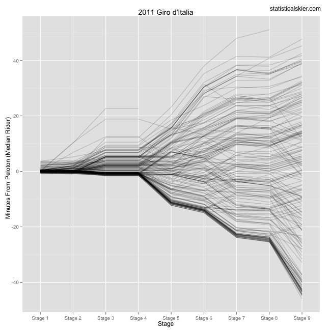
Here’s a look at the whole field:
 Each line is a single rider, and the times correspond to the overall, or GC, category after the completion of each stage. Lines heading down are the good riders, and vice versa. I included “results” for the neutralized Stage 4, so all those lines remain constant since nothing changed. (Indeed, I simply extended every line, even if that person did not continue past Stage 3.) A higher quality (PDF) version can be found here.
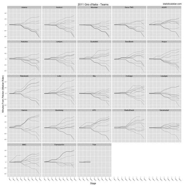
The following graph is roughly the same concept, but broken down by team (click for larger version):
 This graph is even larger, so again you can find a higher quality version (PDF) here. I don’t spend quite as much time on this data as I do the skiing stuff, so I won’t make any strong claims about them being free from errors. If you spot anything glaring, let me know.
If you have cycling friends who also like graphs and data, feel free to pass these along and re-post them. Enjoy!
[ad#AdSenseBanner]
Post a Comment