Thanks to some help from Jan at WorldOfXC.com, I’ve been slowly gathering the split time data for World Cup races from this season. Analyzing them is tricky, though, for a variety of reasons.
First, the data quality is poor. There are numerous instances where the live timing data is obviously wrong in a way that I can’t fix by hand, and so a certain number of split times need to be omitted completely. Second, the live timing data itself doesn’t say exactly how far into the race each timing instance is, so I have to infer that from the times and the length of the race. It works pretty well, but I’m sure it’s only accurate to +/- 500 meters or so. Lastly, handicap start races have to be dealt with separately, since the live timing tracks the time from when the first racer starts, not from when each racer starts.
Still, I’m beginning to find some interesting stuff. A little later I’ll show you some graphs on individual skiers that can shed some light on tactics and performance that I think are kind of interesting. For now, though, the obvious:
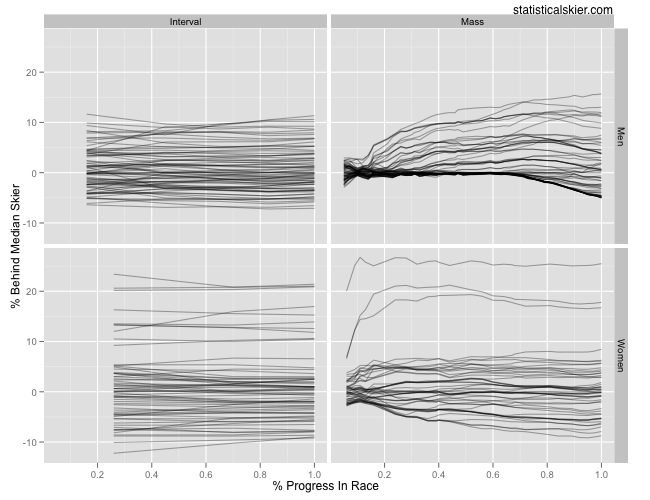
 These are the 10/15km interval start races and the 30/50km mass start races from World Championships this year. Since I’m comparing races of different lengths, the x axis isn’t the number of kilometers into the race, it’s the proportional progress through the race distance. At each split measurement, I’ve calculated each skier’s percent behind the median skier at that point in the race and then plotted this progress as a line for each athlete. I’ve included a little alpha blending since lots of the lines are directly on top of each other, particularly for the mass start races.
Remember that this is tracking relative performance, not absolute performance. So the men’s mass start graph is not necessarily saying that 2/3 of the way through the race the lead pack suddenly accelerated. It’s just that at that point the median skier was finally popped off the back of the lead pack and so either this person slowed down, or the pack accelerated. But you can’t really tell which from this graph.
The differences here are pretty obvious, no?
[ad#AdSenseBanner]
{ 6 } Comments