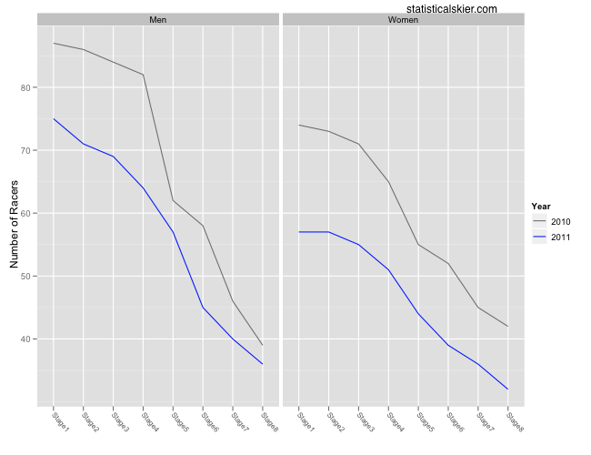
These are mostly just for fun, although I suppose some lessons might be drawn from them as well. Â First up is a graph showing how the field was reduced stage by stage in both 2010 and 2011:
 Overall there were fewer racers this year even from the start, which is interesting. Â In both cases there is a major event later in the season (Olympics last year, World Championships this year) which might cause some skiers to skip the Tour. Â I would have thought more people would skip the Tour last season, since the Olympics are arguably a bigger event and occur closer to the Tour.
Generally, both the men and women appear to have lost skiers at roughly the same rate between the two years. Â I wonder if we’ll see the second sprint moved even later in the Tour in the future as an attempt to keep more skiers around.
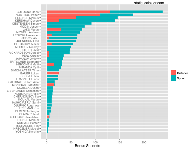
Next we have some simple bar charts showing the breakdown of bonus seconds won by each skier in just this year’s Tour:


{ 3 } Comments