American ski fans have gotten spoiled this season with some outstanding results. Even allowing for the fact that we probably all know that classic sprints aren’t really one of the stronger events for the US, today’s results might have seemed a bit underwhelming.
This sort of situation is what I consider the ideal use of data in skiing. Not some big fancy analysis, just a simple gut check with a quick graph. The metaphor I like to use is that race result data’s best role in the sport (at the moment) is as a sort of “guardrail for the brain”. Our minds are amazingly talented at taking small bits of information and spinning pretty elaborate stories to explain them. Some simple looks at the data may not provide us with some groundbreaking insight, but it can often prevent us from driving wildly off the road.
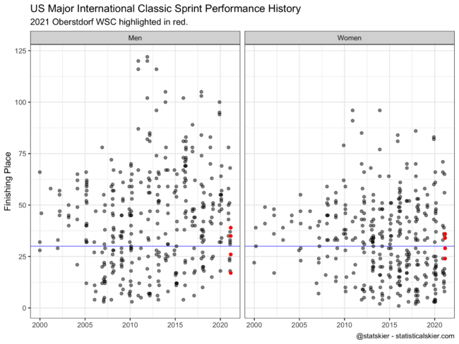
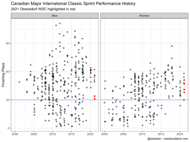
So here’s the history of major international classic sprint performances for the US and Canadian skiers:


In line with my previous discussion, I’m not claiming this gives us any big insight. But! I can glance at these graphs and quickly calibrate how I feel about how the US & Canada did today, in a broad sense:
- The US women had a notably off day, maybe not terrible but not great
- The US men did ok, maybe about as well as we might expect
- The Canadian men had a pretty good day (coming from a pretty low baseline)
- The Canadian women had a maybe ok or only slightly disappointing day, again from a pretty low baseline
My one caveat is that this is obviously at a “program level” assessment of the day, rather than at the level of the individual athletes, where their particular histories would potentially lead you to different conclusions about whether their individual results were good or bad today.