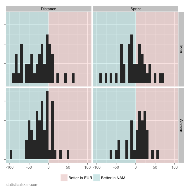
Last week I wrote about how US and Canadian skiers fared last season, in terms of FIS points, when racing in North America versus in Europe. That included a rather almost too perfect looking symmetric, normal distribution for the men’s sprinters. On it’s face this suggests that the difference in median points earned by North American sprinters in Europe versus at home, while possessing a fair bit of variation, is basically centered perfectly at “no difference”. A reader complained about this apparent statistical anomaly, so I offer the following:
This is the exact same plot, only instead of a density estimate I’ve used a simple histogram (yes, yes, I know, a histogram is a sort of density estimate). I suppose if you wanted to get all shamanic and read the tea leaves on this, you could argue that the four short bars on the extreme left of the men’s sprint panel argues for a less symmetric distribution than the density estimate showed. But I think we’re splitting hairs at that point.
The sample size here is what I’d call medium-ish, at around 75 individuals for the men’s sprint panel. I think the best argument against what I posted last week is not that the distribution appears remarkably symmetric, but that perhaps my choice of smoothing parameter for the density estimate (in truth, I simply used the defaults for my software) were perhaps a bit….aggressive for 76 data points.
Later in the week I’ll update this with a look at how these values have changed from season to season.

Post a Comment