This post is somewhat of a teaser trailer for the sorts of things we can do once we have a complete record of major international ski results stretching back to the 70’s.
A natural and possibly controversial question is whether the World Cup field has become more or less competitive over time. Â Intuitively, I think it’s clear that it probably has. Â That’s just the natural progression of any sport as it attracts more money, sponsors and participants. Â The skiing community as a whole simply gets better at producing fast skiers.
But this process can make it difficult to compare the results of today’s athletes to those of many years ago.
In a sort of XC skiing data fantasy world, we’d like to make direct comparisons between modern skiers and historical skiers (i.e. is Petter Northug faster than Gunde Svan?). Â The only real way to answer that question would involve time travel. Â We can, however, make relative comparisons about the entire field. Â So we can ask the following: Is the average 30th place finisher on today’s World Cup closer to or further behind the winner than the average 30th place finisher in 1984?
To do this I grabbed some preliminary data from my big data entry project. Â To keep the comparison and fair (and simple) as possible, we’re only going to look at men’s interval start classic races. Â (I think it’s pretty obvious that skating comparisons are going to be problematic.)
I happened to have all the results for World Cup races from the 1982-1983 and 1983-1984 seasons, so those races will serve as our “historical” data set. Â I’m assuming that all these races were classic races, which isn’t technically correct, if I have my history right. Â At least a few of these races had experimental “skating zones” where people were allowed to skate for a few hundred meters at a time. Â Personally, I think that’s a small enough deviation from “classic skiing” that for these purposes, we needn’t worry.
Next, we’ll take a roughly equivalent number of modern men’s interval start classic races. Â The result is around twenty historical races and twenty modern ones (from across the last several seasons, since classic interval start races are more spread out in the schedule).
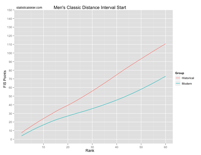
The following graph shows the average FIS points (calculated using modern rules for all races) for both groups versus finishing place:
 I was expecting the average modern skier to be closer to the winner, but I wasn’t expecting the difference to be this large or to range across the entire field like this.
Now, World Cup point rules have changed as well. Â Back in the day, only the top twenty scored points, and the point scale differed. Â Still, we can make some sensible comparisons for the average 10th, 20th, etc. place finishers here.
For interval start races, FIS points are essentially just percent back times 800. Â This means that the average male 30th place finisher in the early 80’s was ~2.5% further behind the winner than today’s average male 30th place finisher. Â Two and a half percent! Â That’s probably almost a minute in a 15km and just over two minutes in a 30km.
Obviously, the point here isn’t that the skiers from back in the day were slow. Â Remember, we can’t say things like that because that would be a direct comparison. Â It’s just that when the sport was younger, there were fewer people able to ski close to the winner.
The way I like to think about this is to compare the World Cup circuit to a game of musical chairs. This entails reading the above graph “backwards”. Let’s start with a 30 FIS point World Cup result. If we move across horizontally from that spot on the y axis, we see that there were typically around 15 skiers in the early 80’s who were capable of finishing that close to the leader. Continuing across the graph, we can see that that number has increased to around 25 now. So you could think of that as adding 10 people to a game of musical chairs that started with 15 people and 15 chairs.
Post a Comment