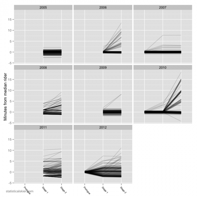
Another bout of cycling fandom will keep us busy for a bit this July. Obviously, as of last night we’ve only had a handful of stages, but unlike with the Giro I have a bit more historical data to compare it do. I’m only going to do a handful of types of graphs for the Tour, but update them regularly. So we’ll start things off with a simple bumps chart that compares this year’s Tour to the last several years:
(Click for a larger version.)

Post a Comment