Sometimes you have some data and a specific question. Â Other times, you have some data, and you just sort of noodle around with it aimlessly. Â Sadly, I’ve been known to do that just for fun. Â I know, I’m a nerd.
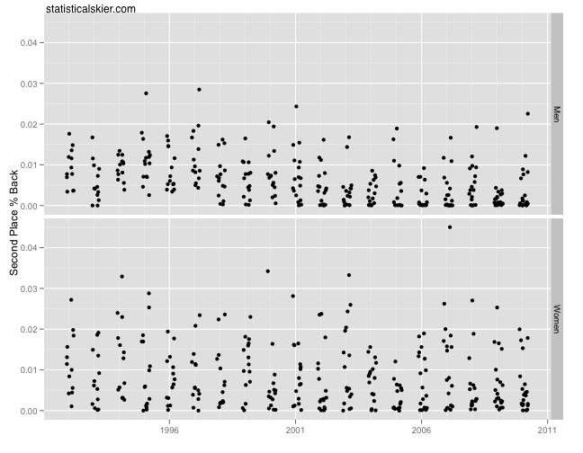
So I was looking at the gaps between 1st and 2nd place finishers in World Cup, Olympic and World Championship races (measured in percent back) in my free time. Â You know, that’s just the sort of thing I do when I’m bored.
And here’s the plot:
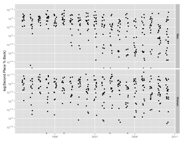
 One could easily just glance at this, say “Meh” and move on. Â Ah, but what if I plot is on a log scale?
 Can you see it now? Â Weird, huh?[1. The dots cutoff at the very bottom are actually some rare ties, which I had to inflate slightly when taking the log.] Â Just to spell this out, for some reason, prior to the 1998-1999 season the gap between first and second for the men was quite consistent. Â And then suddenly in 1997-1998 we started seeing a steady supply of much closer races.
The introduction of mass start races ought to explain this, as far as I can tell, since the dates are pretty close to matching up with the introduction of more mass start races. Â But the women seem unaffected, which wouldn’t necessarily fit with the mass start explanation.
Thoughts? I’m open to suggestions…
[ad#AdSenseBanner]
{ 4 } Comments