The Tour de Carnage France is well underway. I planned to post a few graphs on Monday, the Tour’s first rest day, but a skiing post took precedence. So these graphs run through yesterday’s Stage 10.
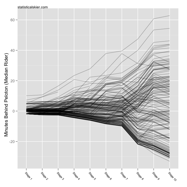
As usual with these cycling posts I’m not going to say much. I’m just putting the graphs out there since I find them interesting and hope that others might too. Here’s the standard graph for this year’s Tour:
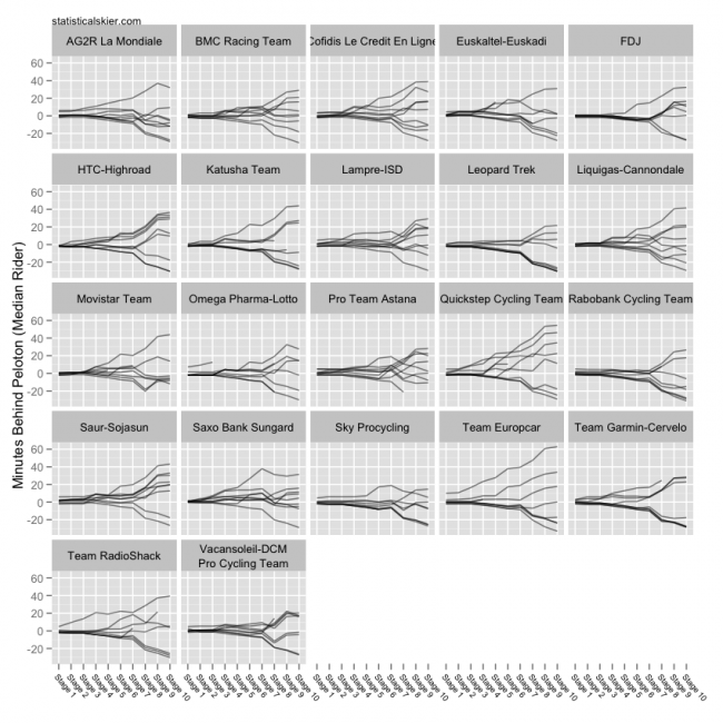
 Each line corresponds to a single rider and all times are relative to the median rider (after that stage). And here’s the same thing broken down by team. It’s larger, so click through for the full version:
 Apologies for not sorting the teams in a more appropriate manner than alphabetically.
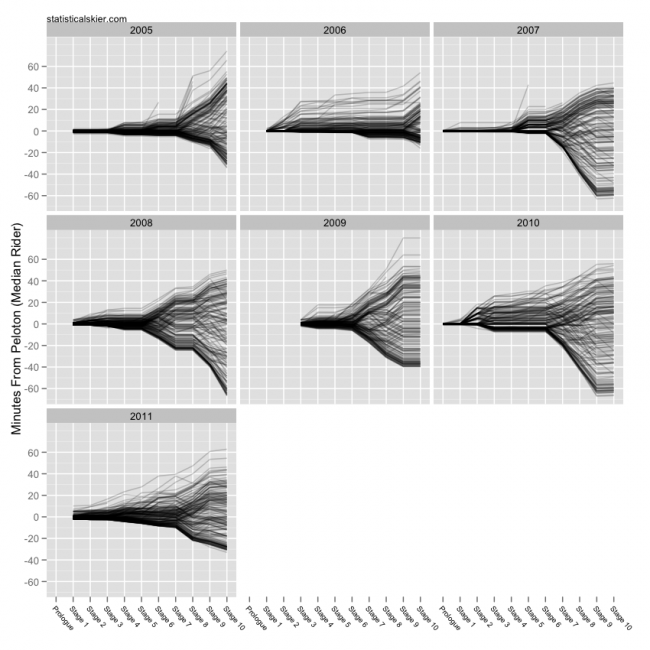
Finally, I happened to grab some Tour data stretching back to 2005, so here’s how this year’s Tour compares to recent years, through Stage 10:
 Note that 2009 starts with Stage 3. The results on CyclingNews for Stage 2 in 2009 were messed up so I had to trash them (the times at least). Why not plot Stage 1 either? Well, I could have connected the dots directly from Stage 1 to Stage 3, skipping the missing stage, but that seemed more potentially confusing.
I thought at first that something went wrong in acquiring the data for 2006, since it looks so different, but I checked and I think it’s right.
[ad#AdSenseBanner]
Post a Comment