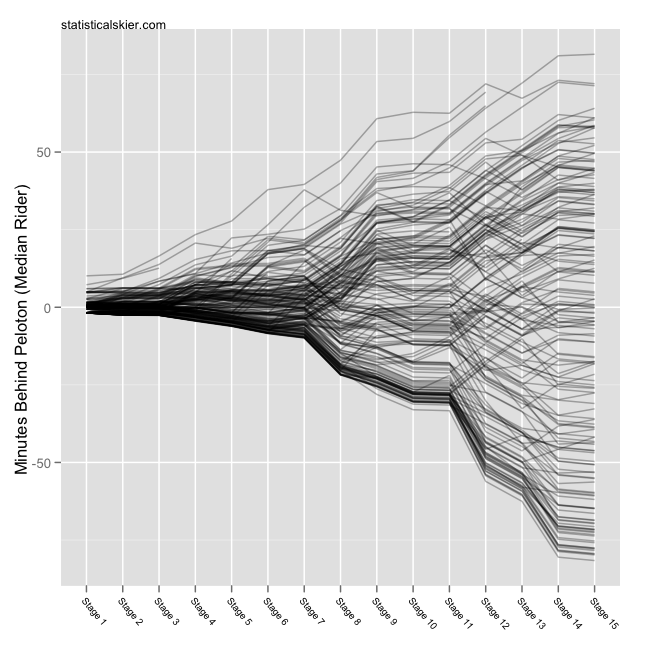
Rest day number two is upon us, so it’s time to update my graphs tracking the race thus far. First the standard ‘bump chart’ showing the GC picture through the first 15 stages:
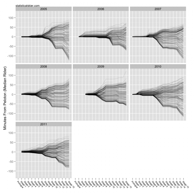
 And for comparison, the same graphs for all the Tour back to 2005 (click for larger version):
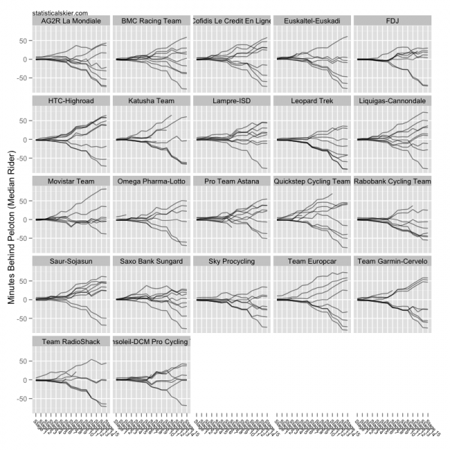
 And another version broken down by team (click for larger version; my apologies I forgot to fix the team names sizing, so some are slightly cut off…):
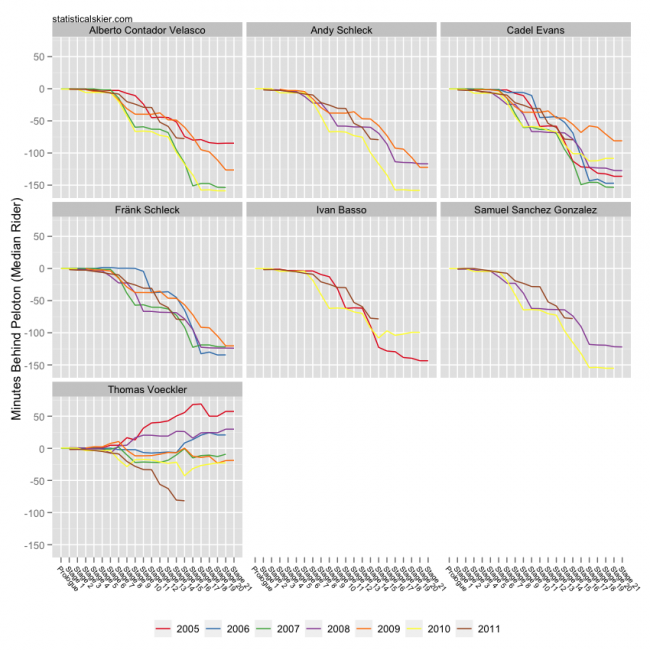
 And finally as a special treat, the GC performance, as measured by minutes behind the median rider, for the top few riders in this year’s Tour:
 Which one of these riders is not like the others? Which one of these riders just doesn’t belong? (Or maybe he does…)
[ad#AdSenseBanner]
{ 1 } Comments