Earlier this week I looked at the split times for some individual US and Canadian WC skiers. Today, let’s back up a bit a get a bit of a bird’s eye view. (Dont worry, I’ll look at some other top WC skiers in more detail in subsequent posts.)
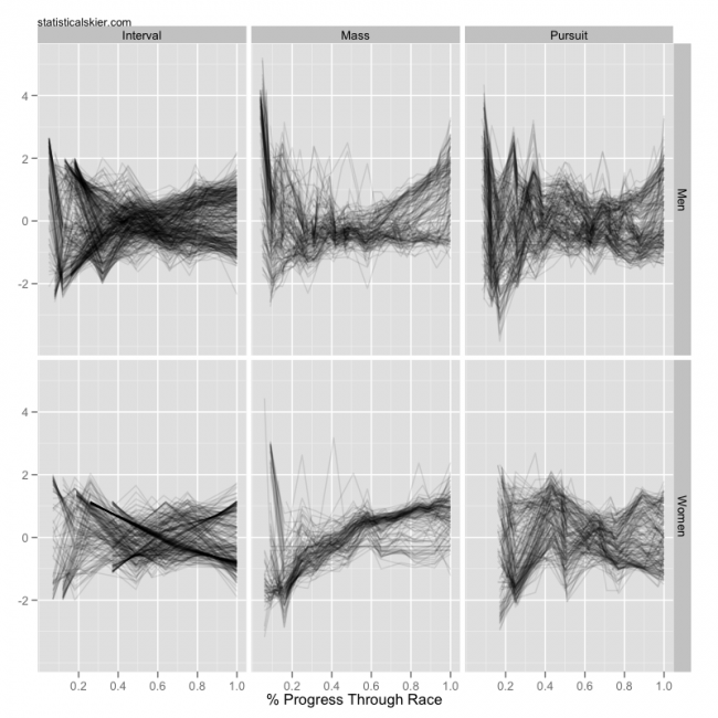
The following graph shows all the split times from last season (that I possess):
 This is compressed a bit; you can click through for a slightly larger version.
As I noted in my other posts using this data, understanding what’s going on with the y axis here is a bit subtle. Each line corresponds to a single race by a single athlete. At each split, I’ve calculated the % behind the leader (at that point in the race). Then, I’ve standardized these % back values within each athlete’s race. So values above zero mean that athlete, in that race, was further behind the leader than their average % back in that race.
I’ve alpha blended the lines so we can better see trends; darker regions mean there are more lines there. Let’s take this one race category at a time.
Interval start
Early on in a race, say in the first 20-30%, people have a tendency to bounce around quite a bit. That’s understandable. It’s early in the race, people are pumped up, and with only a few minutes of the race gone just a handful of seconds can look like a big change in the % behind the leader.
What I notice about both the men and women is the appearance of two distinct groups of skiers, trending in opposite directions, over the second half of the race. (Keep in mind that skiers who end the race with a low value, say -2, aren’t necessarily even in the top half. They’re just much closer to the leader at the end of the race than they were at any other point.) It’s probably most clear with the men, where you have a big chunk of folks picking up the pace during the second half, and then another big group of folks who are falling behind.
Mass Start
The mass start panels might seem a little puzzling at first, particularly the women. At first glance it looks like basically all the women end mass start races further behind the leaders than at any point in the race! That clearly can’t happen since someone has to win. So note that there are some lines that end the race in the negative, closer than average to the leaders. But think for a moment about how most women’s mass start races played out last season. Was the field super competitive, or were there a small number of women would eventually move to the front and stay there, often way off the front?
So if you think about someone like Bjørgen, skiing off the front after the first half or so, all her % back splits will be 0. And nearly everyone else will be falling further and further behind as they start racing just for 2nd (or 10th or whatever). So that panel is more a reflection of the unbalanced nature of the women’s field than anything else.
The men look a bit less confusing. You see a lot of “noise” early on that settles down by around the midpoint of the race. Then the pace most likely starts to quicken (or the weaker skiers start to get tired) and you see a large group of folks starting to split off, unable to keep pace with the leaders.
Pursuit
Both of these panels exhibit considerably less of an overall trend. I think what might be going on here is that, compared to the mass start races, the equipment change messes with the race dynamics a bit, keeping the pace even lower than usual during the first half. In the men’s case, you do eventually see the slower skiers splitting off right before the end. There might be something similar going on with the women, but it’s fairly muddled.
[ad#AdSenseBanner]
Post a Comment