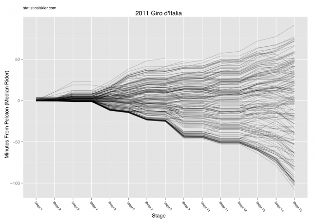
We’re through Stage 15 of the Giro, so here are some updated versions of the accompanying graphs. I made these “high quality” (i.e. PDFs) in case anyone wants to repost them elsewhere. Here’s the overall GC picture:
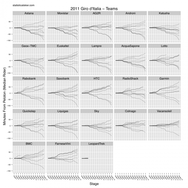
 And then we have the same data broken down by team:
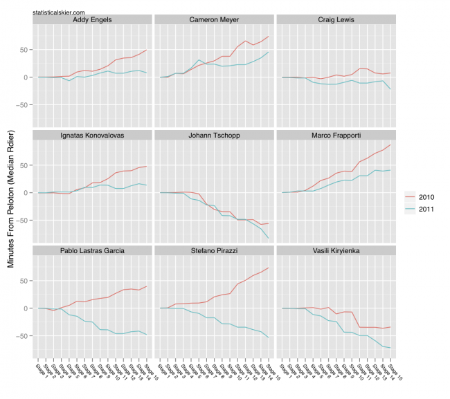
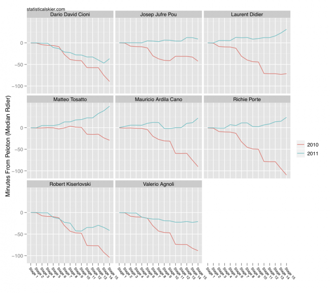
 Just for fun, I also dug around among those riders I could identify as having participated in both this and last year’s Giro (and made it to Stage 15) who are either doing considerably better or considerably worse than last year. First the big improvers:
 My measure of “improvement” was simply the difference in the rider’s minutes from the median rider after 15 stages. And here are the folks at the other end of the spectrum:
 Enjoy! Back to skiing topics on Wednesday…
[ad#AdSenseBanner]
Post a Comment