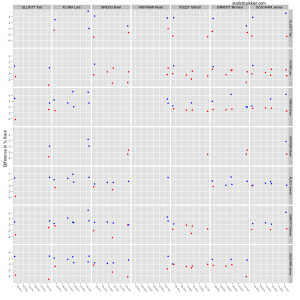
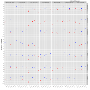
Continuing on from yesterday as promised, we have two rather large graphs showing the head-to-head results of some top US skiers on the domestic scene. Â These graphs are, well, big and to be honest I’m not particularly proud of them. Â I’ve been struggling with how to display the head-to-head results from a large number of pairs of skiers in an appealing way and quite frankly I haven’t had much luck. Â This is the least bad option I’ve found so far. Â Even so, it clearly won’t work for a truly large number of skiers.
In any case, here they are:

 These may be a bit confusing at first, so let me explain. Â You should read these by focusing on rows of panels. Â For example, in the men’s graph we have a row of panels for Lars Flora. Â Each of these panels displays his results versus the person in that column using the difference in percent back. Â Red dots mean the person on the row won, blue means the person on the row lost to the person on the column. Â So the large number of red dots in the Lars Flora row is good (for Flora).
It’s not the best, but you can at least scan along a row and get a sense for how often someone is winning versus a particular person.
{ 1 } Trackback
[…] I posted some graphs looking at a few of the top US domestic skiers and their results so far this season, wrapping up […]
Post a Comment