One of my articles for FasterSkier.com looked at variability in skier performance, particularly among elite World Cup skiers.  In truth, I kind of dashed that article off in a hurry simply because Kris Freeman happened to make a comment about the topic on his blog, and have always wanted to come back to the subject.
Variation is the name of the game for statisticians. Â It’s what we do. Â Ingrained in every statistician is the expectation that things will vary. Â We measure it, quantify it, adjust for it.
In each of the graphs I make, particularly with the more “serious” ones I try to incorporate as much information regarding variability as I can. Â On occasion, that can result is a fairly complex looking graph that has a lot of “stuff” on it. Â Obviously, there’s a balance to be struck here.
Displaying how variable the data are, not just the trends, is crucial. Â To show you why, I’m going to revisit the graph from this short article I did on FasterSkier, where I looked at age vs. FIS point trends broken down by the level of success each athlete had achieved at World Juniors of U23s.
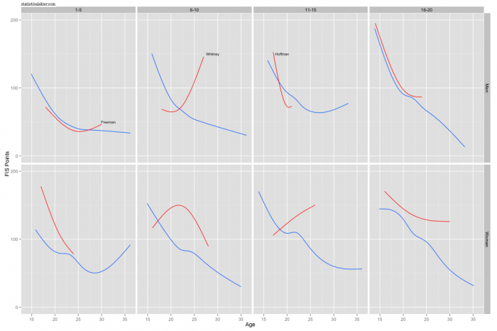
Here’s a version of that same graph only showing information on the global trends:
 Without all the points in the background, this graph looks much cleaner. Â This might fool us into thinking that it’s actually easier to understand in this form. Â But I would argue that with only the trend lines, this graph is seriously misleading. Â It is too easy to be lulled into thinking that each blue line represents some sort of inexorable Law of Skiing. Â Additionally, in comparing the red trend lines (American athletes) vs the blue trend lines (everyone else) this is dangerous. Â Where the lines are quite different we might be tempted to conclude something like “every other athlete develops like the blue line, but the American’s don’t”.
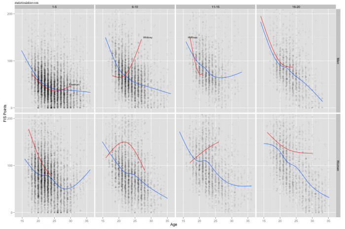
This would be a terribly incomplete description of the data. Â That’s why I included all of the actual data points in the background (with some alpha blending, to give a sense of where the points are denser):
 This gives us crucial context for interpreting the trend lines. Â Specifically, the actual FIS points display a significant amount of variability around the trend lines. Â This should give us some reason to be cautious.
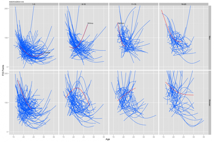
It suggests that while the blue trend lines are good at depicting what happens for the average skier in each panel, there may not be very many skiers who are actually close to “average”. Â How varied are the actual individual skiers? Â Well, let’s look at the same plot, but with blue trend lines for each individual skier (and the same red trend lines for the Americans):
 I’ve omitted the points and instead plotted a trend line for each individual skier. Â Each blue line corresponds to a single, non-American ski racer. Â My point here is to emphasize how many of these lines are quite different from the single, general trend lines from above. Â Can you see how this might lead us to read the graph, and the data, differently? Â A world with zero variability would mean each blue line in this third plot mirrored the global trends from the first plot exactly. Â And that would be pretty boring.
I don’t mean to say that general trends, like the ones in the first graph, are somehow wrong. Â Useful lessons can often be learned from them. Â But anytime we attempt to move from the general (the average trend over all skiers) to the specific (the trend for a single specific skier) we should use caution.
[ad#AdSenseBanner]
Post a Comment