I was following Andrew Gardner’s twitter feed a while back during the USSA spring meetings, and he mentioned a comment by James Southam that American courses are far easier than those in Europe. [1. I’m paraphrasing here; it was something to that effect.]
That got me thinking about whether there was any way I could look at this question using, you know, data. Â The short answer is that I can’t. Â At least not very well. Â But the data I looked at are interesting in their own right, and serve as a good example for the sorts of ambiguities and mysteries that can pop up when you’re analyzing data.
My basic idea was to look at skier speeds (in sec/km) and compare these speeds between some domestic races and some international races. Â I didn’t have particularly high hopes for anything meaningful to fall out. Â There’s just way too much variability in skier speed due to weather, snow conditions, inaccurate course length measurement, etc.
What follows is the “cleanest” look at this kind of data I could manage, at least as a first attempt. Â The first problem to overcome is data subdivision. Â I can’t mix techniques or race distances, for obvious reasons. Â That means I’m limited to a single race format at a time. Â I settled on 10/15km interval start races, mainly because they were the format I had the most examples from among World Cup and domestic races.
Still, I don’t have a ton of domestic races in my database (just those from FIS, essentially). Â Setting a cutoff of the 2004-2005 season gave me around 20 women/men 10/15km interval start races in the US that weren’t World Cup or Olympic races. Â Then you have to split them by technique, leaving only ten in each category or so.
The other complicating issue here is the natural variability in skier speed, within a single race. Â That’s probably going to swamp any differences between domestic and international races, so I just grabbed the top ten times from each race.
That means I’ve got the top ten times from a bunch of international and domestic 10/15km interval start races, which I can then convert into average speeds by just dividing by 10 or 15.
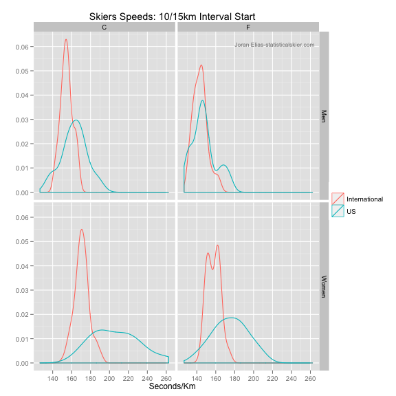
What I expected to see was that the distribution of top ten speeds in domestic races lags behind the top ten speeds in international races. Â No brainer, right? Â In the off chance that the speeds are comparable, that might (maybe, possibly, kinda) be taken as evidence that US courses are on the easy side.
Huh. Â The women are behaving pretty much as I expected. Â Men’s domestic classic races are slower, too, but less than I thought. Â Then you have the men’s domestic skate races, which match up fairly well.
Now, if we were stupid (which we’re not, right?) we might jump to the conclusion that the top men in domestic skate races are actually skiing at the same speeds as the top World Cup skiers. Â Until they actually go to Europe, of course. Â And then suddenly they slow down. Â Or the courses, and just the skate courses, for only the men, are very easy in the US.
Yeah, that doesn’t make much sense to me either.
The domestic race distributions here aren’t based on very many races; only about 10 in each panel. Â About half are SuperTours, a handful of western collegiate races and a handful of US Nationals. Â If there were a small number of outlying races in this group of 10, we’d see it in the distributions. Â But we don’t. Â So either the data are “right”, or somehow nearly all ten of these men’s skate races were unusually fast.
I asked around with some skier friends of mine, and it turns out that many of the domestic men’s skate races here were in fact unusual. Â Many were held in low snow conditions on alternate courses that were unusually easy. Â There might be a 15km mass start race in there that’s been misclassified by FIS.[2. I still need to check this.]
At this point, I was feeling pretty good. Â Anomaly explained.
But then I started thinking. Â Why weren’t the corresponding women’s courses also unusual enough to make the women’s skate races look fast too? Â Why is it only the men’s skate races?
Currently, I don’t have a great explanation for this, except the catch-all “Not enough data.” Â Which is fair enough; I’m stretching the data pretty thin here. Â Still, it’s weird. Â And bothering me. Â So here’s the list of races:
[table id=23]
I suspect there’s at least one or two classification errors in this list of races. Â Anyone have any better explanations?
[ad#AdSenseBanner]

{ 4 } Comments