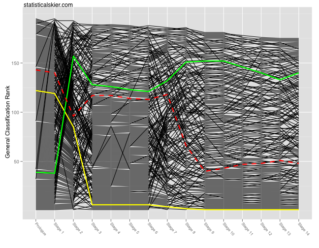
So I decided that updating these every day would get tedious. Â Here’s the standard bumps chart after stage 14 and the corresponding average speed bumps chart is below the fold:
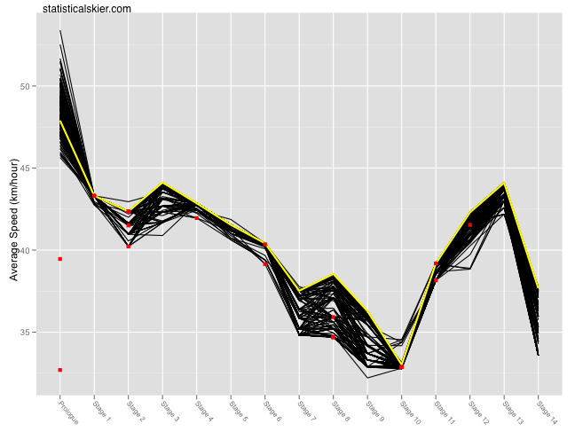
And the average speed version:
 You’ll notice that this one looks a bit different. Â I’ve added red squares that correspond to dropped riders. Â The squares floating off in space in the Prologue correspond to riders who dropped after the Prologue, which is why they don’t have black lines at all. Â Can’t draw a line with only one data point!
One bit of commentary I meant to include last time I posted this average speed graph was that I was mildly surprised at how near the top the Yellow Jersey line (Andy Schleck) is in each stage. Â Serious cyclers may ridicule me for this misconception, but I think it’s an easy one for the very casual fan to make. Â Namely that TdF winners will put in huge efforts on a handful of stages (mountains, time trials) but then they’ll sit back and not work very hard most of the rest of the time. Â Now, that’s certainly true, up to a point, but clearly Andy Schleck isn’t exactly going slow on the sprint stages. Â Probably most of the resting he gets on those stages comes from staying in the peloton and drafting. Â But his average speed is still pretty high.
Finally, if anyone wants larger or higher quality versions of these graphs just let me know…
[ad#AdSenseBanner]

Post a Comment