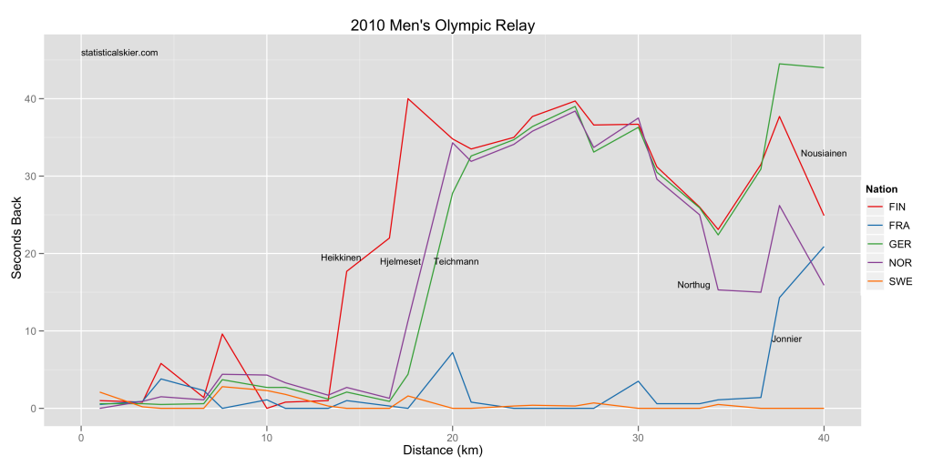
This is type of graphic that I hope to do on a semi-regular basis once the World Cup season gets rolling. Â These easily fall into the “fun” rather than “serious” category. Â If you hadn’t already guessed, I like making graphs. Â So these entries will be race summaries, but in graph form. Â They are fairly labor intensive (manually scraping PDF files for split times, push the data around and annotate it by hand, etc.) so I’m going to pick and choose when I do this, ideally focusing on races that are interesting for some reason.
Here’s an example using the Men’s Olympic Relay from the Vancouver Olympics (click for a larger version):

{ 5 } Comments