Last week I ranted a bit about the inadequacies of F-factors[1. The scaling factor FIS uses to adjust FIS points depending on whether the race was an interval or mass start.]. Â We looked at the results from interval vs. mass start races and determined that they do indeed produce different distributions of percent back’s (PB’s). Â Specifically, the results of a mass start race are more likely to be bunched closely near the top, meaning the top skiers are more likely to finish closer to the winner. Â This leads to many more low FIS points than you’d see in a typical interval start race. Â Here’s the graph from that post summarizing these different distributions: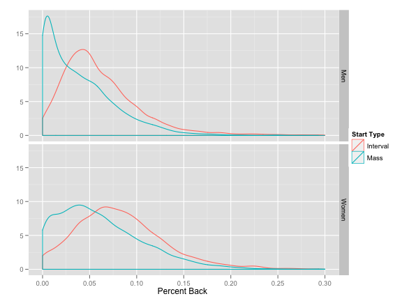 Recall that FIS’s F-factor solution to this problem is to scale all mass start points up by a factor of 1.75, effectively expanding the blue curves above to the right. Â This resulted in the following distributions:
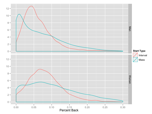 We noted that nothing really has been solved here. Â There is still a huge difference in the points assigned between interval and mass start races.
Additionally, we noted that we’ve actually created a second problem. Â Mass start races still produce more low PB’s than distance races, but they also now produce more high PB’s as well. Â This led me to speculate that fast skiers are likely to benefit from skiing in mass start races while slower skiers are now actively being penalized for it.
I suggested a very simple solution: curve the mass start PB’s to the interval start distribution. Â The resulting mass start PB’s I called Equivalent Percent Back (EqPB). Â Now I thought I’d actually take them for a spin and see what happens.
In my previous post I also speculated that how noticeable the differences between mass/interval start points are will depend strongly on the scale of our data analysis. Namely, large scale analyses that aggregate data over many athletes or nations are not likely to see much difference, but if we drill down to specific athletes and small numbers of races the effects may be large.
To start, let’s look at the differences that pop up when ranking skiers based on their five best races from the 2009-2010 season (click on image for larger version):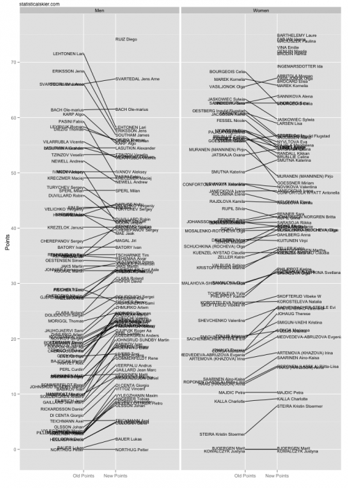 This is a bumps plot (or parallel coordinates plot) and show the change in the average of each athlete’s best five races using the old original points and my new points based upon EqPB[2. Marit Bjoergen and Justyna Kowalczyk tied for first in both cases. Â Names without lines indicate that they experienced a change that took them outside the plotting region in the other column. Â Athletes with fewer than five races are omitted.]. Â Obviously, there’s a lot of overplotting here obscuring people’s names, but let’s just focus on the lines for a moment. Â Notice any general trends?
Switching to points based on EqPB tends to improve the average for slower skiers (at least up to a point; I haven’t shown every skier, obviously) while tending to inflate the average for faster skiers. Â Just as I predicted above, this matches who was benefiting from the mass start races.
Here’s a smaller version of the same plot, zooming in a bit so that the names of many of the top skiers can be seen more clearly: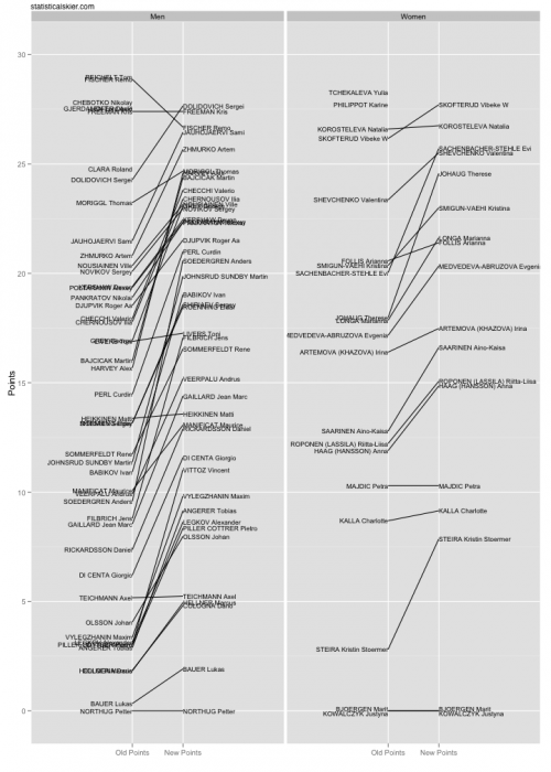 But this is just the average of the raw points. Â How much does it change the actual ordering of athletes? Â This is somewhat tough to see given how dense the names and lines are plotted, so let’s look at another set of plots that just show the athlete’s ranks based upon the average of their best five races:
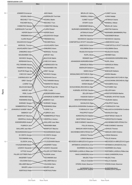 The changes in ordering among the athletes is somewhat less dramatic, though still noticeable. Â Remarkably, the top ten women remain completely unchanged, and none of the other changes involve a move of more than 5 places or so. Â We see more shifts in the men’s rankings, but the biggest change isn’t more than 10 places.
This is roughly what I expected: when comparing individual athletes using fairly small numbers of races (5) the percent back differences between mass start and interval start races can have a significant effect on how we perceive people’s performances. Â Next up we’ll need to confirm that switching to EqPB has less of an effect when examining data that is aggregated over larger numbers of athletes or nations…
[ad#AdSenseBanner]
{ 2 } Trackbacks
[…] Finally, I’ll provide the equivalent graphs using FIS points, which tell roughly the same story. Â I’ve gone the “fancy” route here and adjusted the FIS points. Â Basically, that means that the 30k and 50k points have been scaled to be more comparable to interval start points. Â You can read up on how this works in more detail here. […]
[…] took my alternative FIS point method, EqPB, out for a drive to see how it […]
Post a Comment