[Note: This article first appeared here.]
An endearing facet of cross country ski racing is the seasonal rhythm it introduces into our lives. Â Summer, fall and winter each hold unique rituals and landmarks of training, racing and recovery. Â Spring brings with it its own rituals, among them retrospection on the season just completed. Â Athletes around the nation use these months to reflect on their season, evaluate their performance and plan for the future.
In recent years, the same has been true for the US skiing community as a whole. Â In particular, each spring we are treated to a new round of articles discussing the progress, or lack thereof, of US skiing. Â Fasterskier.com has been a prominent forum for many of these discussions.
I have followed these discussions with some interest and wade into the topic with considerable trepidation. Â I want to be clear that while I was a ski racer for much of my life (occasionally even achieving a level of not-slowness) I claim no expertise on how a nation ought to develop international caliber athletes. Â I have no racing or coaching experience that could even remotely be considered close to an international level of competition. Â However, I do possess a large quantity of data on skiing results, I am more qualified than many as a data analyst, and an obvious thing to do with skiing results data is to look at trends in performance over time. Â If I want to write data oriented articles on skiing, I’ll have to take up the topic eventually. Â Hopefully, I won’t make any enemies!
These discussions have elicited a significant amount of anger and vitriol in the past so I feel compelled to qualify this article with the following:
Nothing that appears in this article is intended to constitute a Final True Answer regarding US international skiing performance. Â No data set can completely capture the entirety of the US skiing community. Â When used well, data can provide a useful guide for future questions and debate. Â In that sense my intention is not to settle a controversy but to provide common guideposts for future debate by people more knowledgeable than myself. Â Finally, nothing that follows should be construed as a commentary on the commitment, dedication or desire of US athletes or coaches. Â Any impression to the contrary is entirely the fault of sloppy writing on my part.
With that bit of ass-covering out of the way, let’s get down to business.
The motivating question for this article is: Are international results of US skiers improving? Â Now, while this question seems simple enough, it needs to be unpacked a bit.
First, we have the obvious breakdown into four subcategories of men’s and women’s, distance and sprint results. Â To keep the length manageable, I’m going to split this article in half, addressing distance results now and sprint results in a few days.
Second, we have to pick a time frame. Â The data I have limits this to seasons dating back to around the early 1990’s. Â (I would love nothing more than to extend this back to the heady days of Bill Koch, Tim Caldwell, etc. Â If anyone knows of repositories of international ski results, with times, that stretch back that far, please let me know!) Â I’m going to take the broadest possible view and consider all the data I have. Â So our time span runs from the 1991-1992 to the 2009-2010 seasons.
Third, we need to pick which races to consider. Â As in my previous articles, I’m going to restrict myself to World Cup (WC), Olympic (OWG) and World Championships (WSC) races. Â My reason is simply that these are the primary “elite races” that we measure international success by and data on domestic races is harder to come by. Â There are drawbacks to this approach that I’ll touch on at the end of the article.
Fourth, we need to select a metric by which to measure success. Â I’m going to use FIS points. Â No system for measuring performance across different races is perfect and FIS points are no exception. Â However, they are an accepted standard and probably do a reasonable job, all things considered.
In the interests of full disclosure, since my source for these data is the FIS website, I am largely dependent on them for accuracy. Â In the process of compiling these data, I discovered many, many errors on the FIS website. Â Most of these errors would not have much of an effect on this analysis. Â However, where I could resolve the issue in a verifiable way, I did so. Â Beyond that, any errors in my data are most likely the fault of FIS. Â Honest! Â Also, FIS doesn’t record points for results during much of the 90’s. Â For these races I have calculated them myself assuming a penalty of zero and current rules on F-values, which while not technically accurate, seems reasonable.
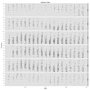
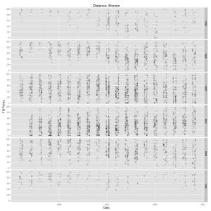
The following two graphs show the FIS points (truncated above at 100) for men’s and women’s distance races from six nations, including the US and Canada. Â (Click on images for larger versions.)
Every FIS point result (below 100) in a WC, OWG or WSC distance race for every athlete from each nation during this time period is shown. Â There’s lots of over-plotting, so I made the dots partially transparent. Â Darker areas indicate areas with more data points.
I don’t know about you, but I find it exceedingly difficult to spot any trends. Â There are just too many dots and it overwhelms the eye.
I could plot a trend line using a scatterplot smoother for each nation, but this presents some problems. Â A typical trend (or regression) line tracks the average (or mean) FIS point result for each nation. Â Now, that might be of interest in other contexts, but given our question it would be somewhat misleading.
For some, discussing US skiing performance means discussing how our best athletes are doing, not our average ones. Â Others may want to include a discussion of depth: how many athletes do we have performing at a certain level? Â Both are legitimate topics of conversation. Â What we’d like is a way to visualize both of these concepts at the same time.
For this article, I’ve settled on an informal version of quantile regression. Â Quantile is the term statisticians use for what most people think of as percentiles. Â As in, “scoring in the 95th percentile” on a test means your score was among the top 5% of all scores. Â Of course, for FIS points, lower scores are better, so when I say “in the 5th percentile”, I’ll mean in the bottom 5%. Â The 0.05 (or 5%) quantile refers to the cutoff value that determines which values are among the lowest 5%. Â The 0.5 quantile is commonly known as the median.
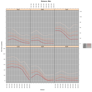
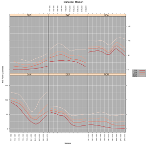
What we’ll do here is look at trend lines for quantiles. Â This will allow us look at trends at different levels of performance simultaneously. Â The following two graphs display the trend lines for the 0.5, 0.25, 0.15 and 0.05 quantiles for FIS points in distance events for men and women in the same six nations as above.
Each line represents the cutoff for that quantiles best FIS point results in men’s distance races for each nation. Â So a Canadian guy in the early 90’s who had a race under ~50 FIS points would have had one of the top 5% results for Canadian men that season. Â Having lines nearer the bottom means your racers are going faster. Â Having lines that are bunched close together near the bottom means you have lots of skiers going fast. Â These two elements, the height of each line and the spacing between the lines, gives us a rough picture of both the quality and the depth of each nation over time.
Now, what can we make of this? Â Obviously, Norway has been very good for quite some time and has a lot of depth: their trend lines are all closely bunched near the bottom. Â The dramatic improvement in the German teams during the late 90’s and early 00’s is easy to spot. Â The Russian men appear to be steadily regaining their form, presumably following a backslide around the break-up of the Soviet Union. Â Interestingly, the Russian women, while certainly very strong, seem to be headed in the opposite direction. Â The Swedish men got a bit of a bump during the Per Elofsson era and have remained consistently strong since then. Â Finally, the Swedish women have been improving over the past 4-5 season, which can be seen in their graph as well.
(I chose these countries to join CAN/USA in the graphs not because I thought they made for the best comparisons, but because their data had some interesting features and they serve as a convenient reference point. Â Obviously I’ve omitted nations whose teams have sizes and budgets more comparable to the USA and CAN. Â I simply decided that international comparisons were not going to be the focus of this article, so I decided not to worry about it.)
How about Canada? Â Their men were plugging along at about the same level as the US men until the Salt Lake Olympics, at which point they began a dramatic turn around which has continued through this past season. Â This trend began long before Ivan Babikov switched nationalities. Â It is interesting to note that all of the quantile trend lines for the Canadian men have sloped sharply downward. Â This tells us that they have been improving top to bottom (or at least top to middle, the median). Â It will be interesting to see what happens to this trend over the next 4-5 seasons. Â If the lines basically flatten out and hold steady where they are now, the Canadian men may end up being reasonably compared to countries like Germany and Russia. Â Exciting stuff!
The Canadian women demonstrate a somewhat different story, that can probably be summed up in two words: Beckie Scott. Â The precipitous dip in their trend lines during the late 90’s and early 00’s roughly corresponds to Scott’s career. Â Of course, this isn’t entirely fair, but it makes for a pithy opening to a paragraph. Â The Canadian women had a fairly deep team during this time period (Sara Renner, Maliane Theriault, the Fortier’s, etc.) and the graph reflects this, as the lines remained fairly bunched together and improved at all levels. Â However, with Beckie Scott’s retirement (and several others) the team’s performance seems to be sliding and perhaps losing some depth.
Finally, what can we say about the US performance over time? Â First, the men: we see some significant improvement from the mid-90’s until around the Salt Lake Olympics, at all levels. Â This is largely the era of Justin Wadsworth, Marcus Nash, John Bauer, Carl Swenson, Â and Pat Weaver. Â Since then, things have essentially plateaued. Â Additionally, we can see that the trend lines are considerably more spread out than in the past and also compared to the Canadian men. Â This would indicate a relative lack of depth.
This time, my pithy opening is a little more appropriate: Kris Freeman. Â Quite simply, he’s been the story of US male distance results for nearly a decade now. Â Indeed, the 5% trend line, representing the top 5% distance results by US men is basically owned by Kris Freeman for the past decade. Â To what degree? Â Well, on the right is a list of the number of sub-40 FIS point races in WC, OWG and WSC (a relatively low bar) by American men over the past decade.
| FREEMAN Kris | 53 |
| SWENSON Carl | 20 |
| JOHNSON Andrew | 7 |
| WADSWORTH Justin | 6 |
| SOUTHAM James | 3 |
| BAUER John | 2 |
| FLORA Lars | 2 |
| KUZZY Garrott | 2 |
| CHAMBERLAIN David | 1 |
| KOOS Torin | 1 |
| LIEBSCH Matthew | 1 |
| NASH Marcus | 1 |
| NEWELL Andrew | 1 |
| WEAVER Patrick | 1 |
More than half belong to one skier, Freeman, and another 30% or so belong to skiers who have since retired. Â The fact that the lines have remained fairly flat for the last 10 years may surprise some people (at least, I was). Â The flatness in the 5% line might be underplaying some real improvement by Freeman, since as we’ve discussed earlier, his blood sugar issues can make him some what erratic. Â Hence a “lack of improvement” in this respect probably hides some real gains that Freeman has made over this time period and instead represents some sort of middle ground between him getting generally faster but having a harder time managing his blood sugar. Â As for the other trend lines, I don’t feel comfortable speculating as to why they may have remained flat over the last decade; my theories about Freeman seem, well, speculative enough as it is.
The chart depicting the quantile trend lines for US women might also surprise some people (again, it surprised me a bit). Â While the top performances have never really broken much below 50 FIS points, the general trend, at all levels, has been improving over the last last several years. Â Naysayers will point out this this improvement is simply recapturing ground lost in the years immediately following the Salt Lake Olympics. Â Compared to the US men, the US women don’t appear to have the same lack of depth: the trend lines for the US women don’t seem nearly as spread out compared to the women from other nations. Â However, this is slightly misleading due to the different scales in the men’s and women’s graphs. Â Note that the absolute gaps from the 5% line to the 50% line are actually roughly comparable between the US women and US men, encompassing a range of around 50-60 FIS points. Â These graphs probably aren’t the best for detecting anything more than coarse differences in the spacings of the trend lines, so I won’t pursue this further, other than to warn you not to parse this feature of the graphs too aggressively.
If the single biggest story in the US men’s graph was Kris Freeman, then I’d say that the single biggest story on the women’s side is the small number of starts on the international level. Â (You thought I was going to say Kikkan Randall, didn’t you!) Â On the left is a list of the number of sub-100 FIS point races in WC, OWG and WSC (a very low bar) by US women over the past decade.
| WAGNER Wendy Kay | 22 |
| KEMPPEL Nina | 20 |
| RANDALL Kikkan | 19 |
| STEPHEN Elizabeth | 9 |
| ARRITOLA Morgan | 7 |
| KONRAD Sarah | 5 |
| DUSSAULT Rebecca | 4 |
| BROOKS Holly | 2 |
| COMPTON Caitlin | 2 |
| BENOIT Tessa | 1 |
| JONES Barbara | 1 |
| SMITH Aubrey | 1 |
| SMYTH Morgan | 1 |
| TRYGSTAD-SAARI Kristina | 1 |
Certainly, Kikkan Randall’s improvements in distance events in recent years (I’ll show you a graph in a bit) is an important component in the direction of the trend lines. Â However, I’d argue that another important story here is that American women just aren’t starting as many international races as the men. Â I found 355 results since 2000-2001 for US men and only 203 results for US women over the same time period. Â The smaller number of races makes the trend lines correspondingly more sensitive to the results of a single athlete.
The reason that I highlight the lack of starts on the women’s side is that if you try to look at trends among individual US women (and I have) you find that most simply don’t have enough distance results at the WC, OWG or WSC level to draw any conclusions, at least from my perspective as a statistician. Â Coaches and athletes may be more adventurous in reading stuff into small amounts of data. Â That doesn’t mean that there’s too little information there to tell us anything, just that there’s too little information for me, personally, to feel comfortable displaying and commenting on it.
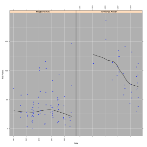
Finally, here’s a graph showing the distance results for Kris Freeman and Kikkan Randall with trend lines (representing the average, not a quantile):
As I warned above, I’m going to avoid engaging in any commentary as to What This All Means. Â Any impression I may have given that I was doing otherwise was entirely unintentional. Â What I can do, now that I’ve given you a bunch of data to chew on, is beat you to the punch and list all the reasons I can think of not to trust any of it!
A bit hyperbolic, to be sure, but I want to point out some major deficiencies that prevent this article from being the Comprehensive Story on US Distance Performance:
– By looking only at WC, OWG and WSC races, we are entirely missing any trends (up or down) among US racers not competing at this level. Â The US has relatively few racers competing on the WC level, so this encompasses a lot of skiers. Â Indeed, one could argue that these data, at least over the last 8 years, mostly reflect the performance of just two skiers: Kris Freeman and Kikkan Randall.
– It is important to note that there are rules governing the number of starts allocated to each nation, the US certainly gets fewer than most other nations, and that these rules change over time. Â If we were interested in explicit comparisons of performance between nations, this should be taken into account.
– The quantile regression method I chose is quite robust, meaning that a small number of exceptionally good or poor races are unlikely to significantly impact the trend lines. Â Depending on one’s point of view, this is either good or bad.
– The trend lines themselves obscure small changes from one year to the next. Â Since I wanted to look at a large time frame, I specifically fit these trend lines in a manner that made them fairly resistant to changes. Â This means that it takes a fair bit of work by the data, over more than one season, to pull one of the lines up or down. Â Again, depending on your point of view, this is either good or bad.
– Many arguments can be mounted that FIS points, as a measure of skiing performance, sucks. Â (In the future, I might put forward a few of them!) Â All sorts of metrics can be concocted: World Cup points, FIS point list ranking and so on.
– I haven’t shown you data from nations with small, low budget ski teams, other than the US and Canada. Â I wasn’t really interested in explicit comparisons between nations, but I will try to revisit this in the future.
– Finally, the data themselves may (and probably do) contain some errors. Â This may include the FIS points I calculated myself, data entry errors by myself or errors by FIS that I didn’t catch or wasn’t able to fix. Â Things that were obviously errors (1.5 hour 5k, anyone?) were simply omitted. Â As a simple example of an unresolved issue, it is unclear to me whether FIS actively returns to old results and recalculates FIS points based upon retroactive disqualifications. Â Obviously, this only impacts the points for major races if the winner is disqualified, but it has happened.
That’s a lot of holes, and I’m sure the commenters will think of many more. Â Still, all data sets and analyses are in some way incomplete. Â At the very least I hope that this serves as a useful starting point and helps to provide some common ground for discussions regarding US international performances. Â And of course, I hope it was entertaining and interesting.
Check back in a few days for the next installment in which we’ll examine sprint results…
[ad#AdSenseBanner]
{ 2 } Trackbacks
[…] if you haven’t read the first half of this article, please go do so now. Â It can be found here. Â I laid out many important caveats in that piece that remain in effect […]
1coordinated
Post a Comment