Honestly, I’m reluctant to wade into this topic, but since this blog is supposed to focus on the intersection of XC skiing and data, I feel like I need to say something. The USST announced their team for World Championships in Oslo, which inevitably led to a certain amount of griping about the choices made or the tools used to make those choices.
I spend a lot of time looking at XC skiing results data in far more detail than most people and I can’t see anything remotely questionable in the selections. What I mean by that is that if you compare the team they selected with a detailed look at all the available race results so far this season, nothing seems obviously wrong to me given the particular set of races on the schedule in Oslo.
Clearly, some judgement calls were made, but that’s inevitable. No ranking system is perfect. No matter how complex or sophisticated your points system and ranking method is, there will be instances where it fails to capture the “truth”. Data should be a guide, not an ironclad law.
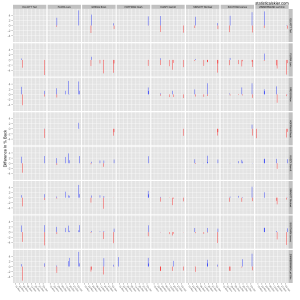
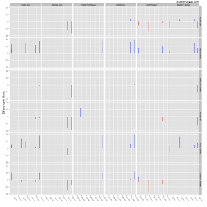
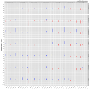
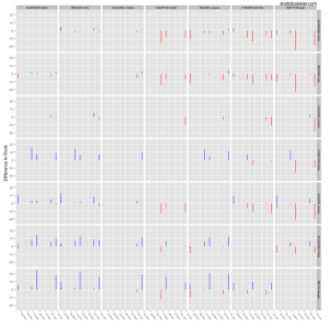
As some food for thought, here are some slightly improved versions of the graphs I posted this morning, but with versions for sprinting as well. Once again, there are surely some “contenders” that I haven’t plotted; this isn’t meant to be an exhaustive look at everyone vying for a spot on the WSC team. The modification I made is to plot line segments rather than points. I recommend reading them by row: red lines are “good” for the athlete in the row, blue lines are “bad”. Only instances where each pair of athletes raced against each other are counted. The length of the line segment represents the difference in percent back for distance races and the difference in rank for sprint races. Some general observations follow:
A few simple notes:
- The number of racers who are unambiguously beating the collection of people I’m comparing them to is fairly small. They include Lars Flora, Holly Brooks and to a somewhat lesser degree Sadie Bjornsen.
- Note how many of the other cases are quite ambiguous. By that I mean that there’s a healthy mix of red and blue lines of varying lengths in many of the rows.
- In some cases (e.g. Simi Hamilton) we have only a very few races to go by, if all we are to look at is head-to-head comparisons. If you base your metric on such head-to-head comparisons, how do you give skiers like Ida Sargent or Simi Hamilton credit for strong results in Europe? Conversely, how do you incorporate bad results from Europe? This isn’t so simple.
[ad#AdSenseBanner]


Post a Comment